 Printwear & Promotion The Total Promotional Package
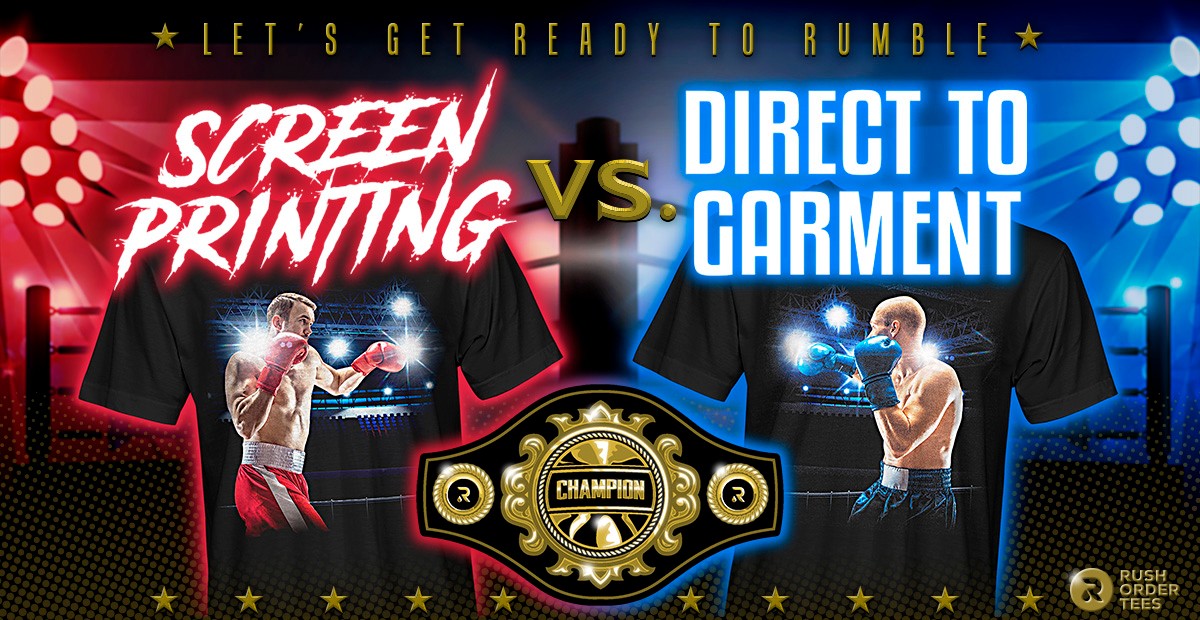
Imri Merritt of Philadelphia-based Rush Order Tees provides a humorous look at screen printing vs DTG printing. Who will come out on top?
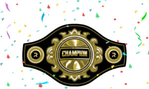
Ladies and gentlemen, people around the world, this is the moment you have been waiting for. It’s the “Thrilla in Phila!” Ten rounds for the Print Method Championship of the World. Let’s get ready to rumble!
As direct to garment digital printing has gained popularity and affordability, the question that arises more and more often: how does DTG printing stack up against traditional screen printing?
In other words, what is the best T shirt print method?
I’m here to answer that question – in the form of a 10-round fight for print method supremacy. Each round will cover a different facet of custom apparel printing, including vibrancy, colour matching, durability, and more. Whichever print method wins the most rounds takes home the championship belt.
And remember kids, nobody is getting punched in the head. It’s just a metaphor. Now on to the introductions…
 In the Blue Corner:
DIRECT-TO-GARMENT
The Challenger
DTG has been around for barely 15 years, but in that time the advancements in technology have come at a rapid-fire pace. Each year this print method gets faster, more affordable, and produces higher quality prints.
The bar to entry for most printing companies is still fairly high. A decent professional machine can cost anywhere from $15,000 all the way up to $800,000. But as business investments go, it’s a good one: a company can start taking low-quantity, on-demand orders without the typical set-up cost and effort of screen printing.
In fact, the majority of online on-demand printing companies are currently using DTG printing machines. Here at RushOrderTees, we have some of the most state-of-the-art machines on the market, but when it comes to high quantities, we rely on traditional screen printing.
 In the Red Corner:
SCREEN PRINTING
The Defending Champ
Screen printing has been around forever (at least since the Song Dynasty in China around 1000 AD) but exploded into modern culture during the 1960s with the popularity of Andy Warhol’s artwork, the burgeoning printed T shirt trend, and the invention of the rotating multi-colour screen printing machine.
A steady stream of technological advancements improved quality and efficiency, but the central concept remains the same: push ink through a mesh stencil onto fabric (or ‘the substrate’ if you want to sound like an expert).
Screen printing remains the most widely known and widely used form of decorating custom apparel, but DTG is fast becoming a contender.
So does screen printing still hold the championship belt, or is it time for the newcomer to take the title? Let’s find out.
A quick word from our referee:
“Alright fighters, we’ve been over the rules. I expect a clean and fair fight. Obey my commands and protect yourselves at all times. Touch gloves and let’s do this!”
 Round 1: VIBRANCY
Screen printing comes out aggressive with the one-two punch of saturation and brightness.
When you want your design to really stand out – when you want it to pop off the shirt – you go with screen printing.
DTG printing has come a long way in recent years, but still has a slightly duller appearance when you compare the two.
So what accounts for the difference?
Traditional screen printing uses plastisol ink (composed of PVC particles suspended in a plasticising emulsion), which are extremely opaque and come in a wide range of colours – exact colours – whether right out of the bucket or with a custom Pantone mix.
[Editor’s note: There are PVC-free screen printing inks on the market.]
Digital printing, on the other hand, uses water-based inks, which lack the opaqueness and vibrancy of plastisol inks, especially on darker garments.
Even though DTG machines can provide a bright underbase (plastic particle pre-treatment and titanium dioxide white ink) which improves the vibrancy, the final results are still lacking, compared to screen printing.
DTG relies on process printing, or the CMYK colour model (cyan, magenta, yellow, and black) to make the various shades of colour.
While the colours themselves are bright and saturated, they are also semi-transparent so that they can be blended more easily. (This blending ability is valuable but doesn’t come into play until the next round.)
With screen printing’s use of plastisol inks, the most vibrant colours available (fluorescents for example) tend to be outside the CMYK colour gamut (or range of possible colours).
The winner of this round is clear. Or should I say opaque?

VIBRANCY
WINNER OF THE ROUND:
SCREEN PRINTING
 Round 2: COLOUR BLENDING
DTG comes out swinging in the second round with excellent colour blending.
What do I mean by colour blending?
Colour blending is the ability to create smooth gradients and a range of colours by blending a lesser amount of colours. And that’s exactly what direct to garment printers were made to do.
A DTG printing machine is essentially a giant version of an inkjet printer, similar to what you might have at your home or office, but it’s designed to print on T shirts and other garments.
When printing DTG, we call it ‘full colour’ but we’re actually using four colours (or six like on the more advanced models like we use here at RushOrderTees). It works using process printing; the four colours of CMYK (cyan, magenta, yellow, and black) blending together to create a spectrum of colours.
How accurately does it match those colours? You’ll have to wait until ‘colour matching’ in round 3 to find out.
What we’re talking about in this round is colour blending.
When it comes to gradients with smooth transitions, subtle elements like smoke that fade into the shirt, or precise blends like those needed for skin tones,digital printing is much more reliable than screen printing. And with little to no setup.
With screen printing, we can take spot colors of plastisol and create a spectrum of colours using a technique known as ‘simulated process’. But the setup involved makes it much less efficient, especially for smaller orders. And the results can be mixed.
With DTG, as I mentioned in the previous round, the inks are water-based and more transparent than plastisol.
This allows the ink to overlap and blend together much easier, making beautiful, smooth gradients and giving DTG the winning edge in this round.

COLOUR BLENDING
WINNER OF THE ROUND:
DIRECT TO GARMENT
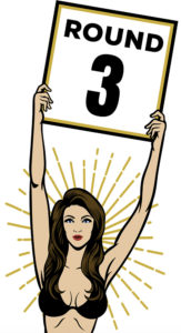 Round 3: COLOUR MATCHING
One round a piece as we go into the third. And screen printing comes back strong with its precision colour matching capability.
Using the beloved Pantone Matching System, we can duplicate any colour you might need. That includes colours that are outside the range of CMYK, super saturated colours and specialty inks.
Matching colours accurately is especially important when it comes to corporate branding. Many companies have brand guidelines that specify Pantone colours. If you try to match those colours with DTG, they’re almost always going to be off.

The primary reason is that the underbase isn’t opaque enough, so the shirt colour bleeds through. Darker shirts and colour shirts can easily become a problem when trying to colour match.
Pantone matching can be done with process inks and specifically with inkjet printing– and is done, all day every day– in other printing mediums. And several DTG manufacturers claim they can Pantone match – but only within gamut.
The most advanced DTG machines have added slots for two extra colours: bright green and bright red. Still, it doesn’t make up for screen printing’s ability to print a range that includes every colour on the planet.
Sure, there are colours that are out-of-gamut for screen printing as well, but overall, its gamut is much bigger than DTG. This round is no contest. When you absolutely need to match exact colours for your brand, you go with screen printing.
COLOUR MATCHING
WINNER OF THE ROUND:
SCREEN PRINTING
 Round 4: DETAILS
Direct to garment is down two rounds to one and is looking to change the momentum of this fight, starting round four with lots of confidence, and rightfully so: this round is about details.
“Excellence is in the details. Give attention to the details and excellence will come.” – Perry Paxton
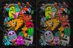
In the printing business, detail is the smallest parts of the design, which could include fine lines, small type, textures, or tiny elements like in the example below.
When it comes to screen printing, it’s always about holding detail. Which means if you’re not holding it, you’re losing it.

There are several factors that affect screen printing detail:
- Screen tension.
- Squeegee sharpness.
- Pressure and speed of ink application.
- The surface properties of the material being printed.
- The viscosity of the ink.
- And the biggest one of all: ink gain or ink spread.
Yeah. It’s a lot to deal with.
If an image is photographic or has gradients (fades, blends), screen printing will require halftones (tiny dots). You might remember seeing them if you ever looked at a comic book with a magnifying glass.
Halftones were developed in the 1800s and first used in newspapers to reproduce the tonal range of photographs, and soon became ubiquitous in screen printing.
The look is such a well-known part of the aesthetic, artists and designers commonly use oversized halftones for a stylistic effect. Think Roy Lichtenstein.
Most halftones for screen printing are output from a RIP programme at anywhere from 30 LPI to 65 LPI (lines per inch) before being burned to screens. The lower the LPI, the bigger the dot.
Even at the higher LPI, these dots are visible if you look close enough. And if ink gain becomes a problem, each dot is going to spread out a little bit. Making it bigger and more visible.
DTG uses halftones as well, but these digital machines can print up to 1200dpi, and use diffusion dither. To get extra technical, this is a frequency modulated halftone instead of an amplitude modulated halftone. It can sometimes result in a grainy look, but a much better reproduction of small details.
DETAILS
WINNER OF THE ROUND:
DIRECT TO GARMENT
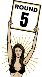 Round 5: DURABILITY
Two rounds each. We have a fight on our hands. But DTG must be worried as the fifth round starts because this one is about durability, or how long the quality of a print lasts.
Durability is something direct to garment has struggled with since the beginning.
In the early days of DTG, you would be lucky to get 10 washes out of a T shirt before the colours would start fading. Nowadays, you can get many many more until it starts fading.
How many washes exactly?
Like most things in this business, it depends. The quality of the machine, the inks used to print, the pre-treatment, the underbase, and the curing all factor into it.
It will also depend on how you wash it (stay away from hot water, harsh detergents, and long times in the dryer). So, yeah. Lots of things to be concerned about.
A well-done DTG print can potentially get dozens of washes before it starts fading a little bit. But fade it will, eventually.
Screen printing doesn’t have this durability problem if it’s done right. Sure, if the ink is not applied correctly or not cured properly, even plastisol can start to fade or deteriorate. But we all have that shirt in our drawer from the family reunion 20 years ago that is still holding on. Longer than some marriages.
DURABILITY
WINNER OF THE ROUND:
SCREEN PRINTING
 Round 6: COMFORT & FEEL
With screen printing in the lead, DTG needs to get busy as we enter the sixth round. But credit where credit is due – it’s a closer fight than anticipated.
By comfort and feel, I mean a few things:
1. If the ink clogs up the fibres. This can severely reduce the breathability of the fabric, causing what is affectionately known as a ‘sweat patch’. You can imagine what that is. Think about someone running a 5K in the summer with a thick, solid layer of plastic covering their chest.
2. How heavy the print the feels on the shirt. If the ink is applied too thick, it can weigh down the front of the shirt, or wherever the print sits. This is especially important for all the lightweight blends that are so popular today.
3. If the texture is rough on the skin. You don’t want a print to feel like sandpaper. You don’t want to give someone road rash from hugging them.
This feel is also known as ‘hand’ in the screen printing business. So if the request is for ‘soft hand’ it usually means to use discharge or water-based ink. If using plastisol, it means to thin the ink down with an additive to make it smoother and more lightweight on the shirt.
[Special note: Discharge and water-based inks will not work on all garment types and are considered specialty inks. For the purposes of this post, I’m comparing traditional plastisol screen printing with DTG.]

Screen printing techniques like ‘distress effect’ can also create a softer hand by reducing the amount of surface area the ink occupies and breaking it up so it’s more flexible.
But adding this style is up to the customer and will not look right on all designs, so this saving grace only applies to particular orders.
Most regular screen printing jobs will be printed with a normal layer of ink, and on dark garments it will be two layers of ink, counting the required underbase.
Plastisol screen printing ink will typically tend to lay heavy on the shirt, and that’s one of the reasons why it’s so durable.
But when it comes to comfort and feel, DTG comes out on top.
COMFORT & FEEL
WINNER OF THE ROUND:
DIRECT TO GARMENT
 Round 7: VERSATILITY
Three rounds to three as we enter the seventh round. These print methods are evenly matched so far. The corner of DTG had some fear in their eyes because this round is about versatility.
Versatility in this context is the ability to print on a variety of textiles, as well as a variety of garment styles, print locations, and placements.
Unfortunately for the DTG corner, their print method is somewhat limited in this category.
Textiles: Although DTG technology can now print on a wider variety of fabrics than ever before, the number one choice recommended is 100% cotton. Newer systems advertise printing on all kinds of fabrics, but they’re not yet widely used in the industry.
Typically, DTG will have trouble with 50/50 blends, and not do well on polyester. It does not work on moisture wicking fabrics at all, without special treatment – and even then it’s not recommended.
Also, the colour of the fabric can be a problem, mostly due to something called dye migration. This happens when the garment dye bleeds into the ink and discolours the print. And digital printing on fluorescent colours is a no-go.
Screen printing, on the other hand, works on cotton, blends, polyester, canvas, denim, performance and moisture-wicking fabrics like rayon – you name it.
And of course, any colour garment your heart desires. It’s easier to tell you what fabrics you can’t screen print on.
Garment styles: If you’re only printing on the basics like T shirts and hoodies, you can DTG all day long. But if you want to print on hats let’s say, your best bet is switching to screen printing (or embroidery).
With DTG it really depends if the printer has a specialised platen (or if there’s even one available) that fits the garment location you’re trying to get printed. This is also true for screen printing, but there are many more platens available.
Print locations: Screen printing is also less limited when it comes to locations. As long as the printer can somehow position the garment on a platen, it can be screen printed. This goes for trouser legs, hoods of hoodies, on-the-pocket prints, side prints, etc.
DTG, in certain cases, may not be able to reach a particular placement within the location to be printed. For example, if you wanted your logo to be placed 1in from the collar of an upper back location, DTG may not be able to get that close to the seam.
Much of it depends on the capabilities of the print shop you’re using. But the bottom line is that screen printing has much fewer restrictions.
VERSATILITY
WINNER OF THE ROUND:
SCREEN PRINTING
 Round 8: CONSISTENCY
While screen printing is leading once again, this has truly been a back and forth battle so far. DTG has a big opportunity to catch up this round because it’s all about consistency.
Not many things in life are truly consistent, but when it comes to printing a run of T shirts, we want them to look identical.
Screen printing can be consistent, but only if the job is set up perfectly and each item is printed exactly the same. Which is a tall order.
The screen printing process has many variables. Screen tension, clogged mesh, ink viscosity, dot gain, flash dryer temperature, squeegee sharpness, squeegee pressure, squeegee angle, registration, placement. The list goes on and on.
Each one of these things can make a difference on their own. Combine them all, and chances are, there’s going to be some variation.
Especially when printing halftones. The last print of the run is going to look a bit different than the first print. It’s just how it goes with screen printing.
DTG, on the other hand, crushes it in the consistency department.
Because a machine processes a digital file and prints directly onto the shirt, there almost no variables to worry about, except maybe the placement of the garment onto the board or platen. Consistency is DTG’s middle name.
CONSISTENCY
WINNER OF THE ROUND:
DIRECT TO GARMENT
 Round 9: SPECIAL EFFECTS
The bell rings and DTG is looking nervous as this one is about specialty inks, something DTG can barely do at all. This round is predicted to be a blowout.
Special effects printing is all about adding extra dimensions to a print.
From raised print to textures to shines and sparkles and glows, there’s a specialty ink or additive that can do it.
The best part is you can combine many of these, for creations that are only limited by your imagination (and budget). Got any crazy ideas?
For example, using puff with high density and suede you can create a faux tackle-twill, mesh, or even embroidered look, complete with fake stitching.
Or, you can stack high-density until you get a print so raised it looks like an appliqué. This can be really cool for a small sleeve logo.

Examples of specialty inks and additives:
- Water-based
Absorbs into fabric for a very lightweight and soft print. - Discharge
Chemically removes the dye from the pigment of the fabric. - Puff
This additive expands while being cured, for a soft, raised feel. - Fluorescent
Very bright neon colours, also known as day glow. - Metallic
Popular ink for a shiny look. Typically in gold, silver, or copper. - Glitter
Contains glitter for a sparkly look, often combined with clear gel. - Glow-in-the-dark
Almost clear, light-activated ink that glows in the dark. - Suede
Similar to puff, but creates a soft and fuzzy texture to the surface. - High-density
Creates raised layers of rubber-like ink for a 3-dimensional print. - Soft Hand
Additive for reducing the thickness of ink for a softer feel. - Clear Gel
A thick glossy coating that can be used in combination with others. - Shimmer
Creates a unique reflective, iridescent shine. - Crackle
Splits and cracks during curing for a naturally distressed look. - Cork
Similar to puff and suede, but the final product has a cork-like texture. - Plasticharge
Combines the best of plastisol and discharge.
This is not a comprehensive list, only the most common. There’s definitely some even crazier stuff out there. It must be a fun job to be the mad scientist who comes up with these inks and tests them.
Printing a specialty job can be a trial and error at first, but once you get it, successful results are super impressive and satisfying to achieve.
Screen printing specialty inks can elevate a T shirt design like nothing else, and significantly increase the value for resale.
DTG has been making a few in-roads on the specialty ink front, but nothing that is widely available or as easy to accomplish. Back to training.
SPECIAL EFFECTS
WINNER OF THE ROUND:
SCREEN PRINTING
 Round 10: POPULARITY
As we start the final round, it’s not looking good for direct to garment, which is down five rounds to four.
DTG has to win this round just to tie, or it needs a knockout – and I’m not even sure how that would work. Metaphorically speaking.
When it comes to popularity, everybody loves the champ. And the reasons why have been detailed in this blog post. Which hopefully you have read and not just skipped to the end.
You may be asking: why is popularity a factor?
If you’re ordering shirts for your staff, or as promotional items, or especially for resale, it’s always smart to go with what’s popular – if you want to make sure your employees or fans are happy.
When people think T shirts, they think screen printed.
Once DTG technology becomes more advanced, and more ubiquitous, to the point where most people don’t know the difference– then popularity might no longer be a factor. Until then, screen printing remains the fan favourite.
POPULARITY
WINNER OF THE ROUND:
SCREEN PRINTING
WE GO TO THE JUDGES SCORECARDS
TOTALS
SCREEN PRINTING … 6 rounds
DIRECT TO GARMENT … 4 rounds
Declaring your winner… by unanimous decision… and still!
PRINT METHOD CHAMPION OF THE WORLD…SCREEN PRINTING!