 Printwear & Promotion The Total Promotional Package

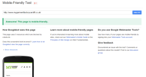
The experts at eTrader provide a little advice on how you can get your website ready to survive the increase in website visits made using smartphones and tablets.
April saw Google roll out what many experts are calling one of its biggest algorithm updates, dubbing it ‘Mobilegeddon’ (it is as epic as it sounds). Following on from the ‘Panda’ and ‘Penguin’ updates, the latest algorithm for online success with Google brings more focus than ever on mobile-friendly sites.
With more customers than ever before shopping online using tablets and smartphones, this was an inevitable change that was going to be rolled out by the Google developers. Online retail trends in the past five years in all sectors have shown a gradual increase in website traffic and online sales from portable devices. It’s no longer simply a case of having a website, an online presence and hoping it takes care of itself.
What does it mean for garment decorators?
Your site must have the ability to operate across different types of platforms and respond to each different device it is displayed on. Whether it is a PC/laptop, tablet, iPod or mobile phone your website has to perform and be user-friendly to your online customers wherever they come from.
For small businesses, the effects could be massive; mobile-friendly sites are an expensive solution. The next few months online are going to be ‘eat or get eaten’, sites will need to adapt to survive in the Google habitat.
The go-to option for businesses seems to be responsive design.
The latest update will have a huge effect and cause a stir on most online markets – the garment decoration one included. Being such a traditional industry, it is considered slightly behind when it comes to technology, so who knows how it’s going to play out over the next few months for print/embroidery businesses SEO.
Sites in our industry with mobile-friendly design are few and far between, so they will undoubtedly flourish. Whereas the majority of the businesses in our industry will be fighting with the rest competing for the remaining rankings available for their business, after all good SEO brings good rewards (financially, of course).
What if I don’t go mobile-friendly?
Mobile friendly plays a huge part in how Google ranks you online – the SEO performance of your site will struggle to keep up with the competition. With traffic and sales affected, businesses will all eventually switch over to responsive, but the longer it takes the more difficult it becomes to climb back up to the top of the Google mountain for all your businesses keywords.
All is not lost just yet…
What we suggest is check Google analytics – see what percentage of your websites visitors are on a mobile or tablet….
If it’s a low percentage (i.e. <10%): Keep an eye on it but there’s no need to hit the panic button yet.
If it’s a middle of the ground percentage (10-40%): Your business needs to adapt and get moving with a responsive site.
If it’s a high percentage (>40%): PANIC! You will need to get responsive ASAP or risk losing customers.
If you are not too sure about mobile traffic and Google analytics – firstly, where have you been hiding?! Secondly, do not worry.